

Storytelling by design - every time you design something, you're trying to tell a story to get people to do the thing you want them to do.
How does design tell a story?
- We look to visuals to tell a story, a narrative. From the time we're young, we look for narratives in visuals.
- Graphic resonance - visuals reinforce the story.
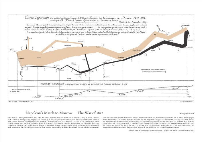
Example -
Modern day examples
-Wired does a really good job at setting the mood for the story they are telling through layouts, typography, etc... in the PRINT version. When it moves online, the mood gets lost.
-We've distilled our stories down to content on websites.
Design can't NOT communicate. Everything you put on a page communicates something.
What are we doing wrong? Why aren't our designs at the same level as classic print work?
- We look through web design through the lens of print design and the two just really don't compare. The common principles aren't common anymore because the mediums are so different.
The Nature of the Medium
1) The metaphorical page
- We've always made marks on stuff, whether or not they were actual, physical pages.
- "There is an urgent need for communication based on precision and clarity." (quote from 1964 - these aren't new problems).
- Constraints of the page: A physical object has the constraints of a length/viewpoint. With a web page, that's tougher to grasp. They can extend out in all directions.
- All-in-one ideal: you need to be able to get to all the contents at one time, opposed to everything being on a different page in a physical book.
- In not point in the production process does the product change in a print piece. On the web, we can affect the way it functions and looks at any time. It's not a set medium.
- With a book, you can see how long it is (10pgs, 200pgs, etc...) there's attainability and grasp of depth. You don't get that from a website.
- Possibly the biggest constraint.
- Golden ratio: 1:1.618 - by basing our work on ratios like this, we can design for sameness and cohesion.
- Rule of thirds: if we align parts of our image along these lines, it creates interest.
- You digest information differently online than you do when you're reading a book. We can look at anyway we want to, whereas most people read a book the same way. Ratio and Rule of Thirds don't apply because they rely on predictable dimensions.
- No One Belongs Here More Than You »
- Fray »
- A Brief Message »
- The Principles of Beautiful Web Design »
- We Tell Stories »
Design for the web has been driven by technology rather than message but the form of design should be driven by the story.
Read posts about other day 1 presentations »


No comments:
Post a Comment